
Why Your Dashboard Looks Great (But Your Product Growth Doesn’t)

June 12, 2025

.svg)
8 minutes
.svg)
.svg)
Everyone says you should "trust the data," but if your dashboard is built on vanity metrics, you're not being data-driven, you’re just being distracted.
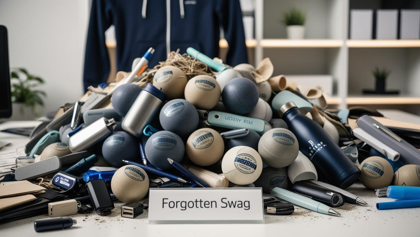
Most teams track what’s easy to measure, not what actually matters. Follower counts, impressions, and traffic graphs look great on a slide, but they don’t tell you if your product is working. They tell you if people glanced at it, not if they gave a damn.
We’ve worked with over 240 companies in developer tools, SaaS, open source, and AI. The companies that scale are the ones that consistently track behavioral signals—indicators of real progress and engagement, not just surface-level popularity.
In this post, we’ll unpack the three metrics that actually matter if you want to build a product developers use, love, and stick with. By the end, I’ll share one insight most teams completely miss when building their dashboards, and why it could be costing you more than you think.
Most Metrics Are Noise
Let’s not kid ourselves. A dashboard filled with surface-level metrics might make your quarterly report sparkle, but it does very little to help you make decisions.
A nice-looking dashboard might be good for your ego. But if you’re not measuring behavior change, you’re not measuring growth. As marketing analyst Avinash Kaushik puts it, “Most dashboards are data pukes—numbers without context or action.”
It’s like counting how many squirrels glanced at your picnic instead of how many sat down to eat. Cute? Sure. Useful? Not remotely.
Stickiness: Measure Workflow Fit, Not Clicks
Let’s start with the metric that most teams only think about after adoption flatlines: stickiness.
What is it? Stickiness is how well your product becomes part of someone’s regular workflow. If your tool vanished tomorrow, would anyone actually notice, or would they just switch tabs and move on?
Why it matters: Developers don’t adopt tools. They adopt workflows. If you’re not inside the day-to-day rhythm of your users, you’re expendable.
How to track it:
- Weekly active usage by developer or team.
- Number of integrations with core dev tools (GitHub, Slack, VS Code, etc).
- Daily command-line usage, PRs merged via your plugin, repeat sessions per week.
- Retention curves and cohort analysis, see what “stickers” are doing in week one that others aren’t.
Real-world example: Linear tracks how many teams integrate them into sprint planning and standups. They’re not just watching login numbers. They’re asking: are we part of how people work?
Stickiness isn’t about clicks. It’s about comfort. Like your favorite hoodie, it just fits into the routine.

Activation: Measure Value, Not Visits
A viral landing page is nice, but if new users aren’t hitting their "aha moment" fast, it’s all just noise.
What is it? Activation is the first moment a user experiences the core value of your product.
Why it matters: Behavior science 101—people stick with what feels easy and rewarding. That first success? That’s your hook. According to BJ Fogg’s Behavior Model, behavior is driven by ability, motivation, and a clear trigger. Activation is your ability + instant reward moment.
How to track it:
- Define your product’s activation point. It should signal value, not completion.
- Track time-to-activation from signup.
- Use funnels to identify where people stall or give up.
- Tag friction points with tools like Heap or Pendo. Speed them up.
Examples:
- Postman doesn’t chase clout. They track how many new users successfully complete their first API request, because that’s what moves someone from "curious visitor" to "active user."
- Vercel tracks how quickly a developer can go from zero to a live deployment. If it takes longer than brewing a cup of tea, they’ve already lost the developer’s attention.
- Retool focuses on how fast a developer can drag in a few UI components and deploy a working internal tool. They treat time-to-first-success like a Formula 1 car—every millisecond matters.
The goal isn’t just to activate more users, it’s to activate them faster. Every second you save increases the chance they’ll stick.
Contribution: Measure Investment, Not Consumption
Most teams obsess over who’s watching. Great. But here’s a better question: who’s building with you?
What is it? Contribution means your users aren’t just consuming, they’re improving, extending, or supporting your product.
Why it matters: Contributors are invested. They’re telling you what to build next. They’re your best R&D, and they do it for free.
How to track it:
- Plugin and extension creation
- GitHub issues filed or PRs merged
- Docs edited, support questions answered, feedback forms submitted
- Participation in forums, Discord, or Slack
Example: Terraform tracks module creation in their registry. It’s not about how many users they have. It’s about how many build on top of what they offer.
Contribution is the ultimate vote of confidence. When users start improving your product, you’ve crossed into something deeper than adoption.
Your Dashboard Should Make You Uncomfortable
Vanity metrics are like karaoke. Everyone feels like a rockstar in the moment, but nobody remembers it the next day.
Useful metrics ,the ones that drive actual growth, are uncomfortable. They show you drop-off points, friction zones, and where users lose interest.
And that discomfort? That’s your advantage. Because most teams avoid it. They hide behind charts that look good in meetings.
So here’s what you do next:
- Audit your current dashboard. Ask: "Does this metric tell me what people do?"
- Drop anything that tracks attention without behavior.
- Assign ownership to activation, stickiness, and contribution.
- Set goals. Review weekly. Make it part of your sprint.
And if you want help?
At Stateshift, we help companies build ecosystems of users, fans, and developers around their products. That means helping you measure what matters, activate what’s working, and build communities that grow themselves.
The Insight Most Teams Miss
The most dangerous metric on your dashboard isn’t a bad one, it’s one that looks good, but means nothing.
So go back to your data. Highlight the ones you’re proudest of. Then ask yourself: Did that number mean anyone changed their behavior? Did it help us decide what to do next?
If not? Bin it. Build something better. And don’t be afraid of a dashboard that tells the truth. That’s how the best products get built.
Enjoyed this one? Share it with someone whose dashboard makes you laugh. Or cry. Either way, they probably need it.
🎥 Want to go deeper? Watch this quick video from Jono Bacon breaking down how to rethink your developer metrics from the inside out:
Related Posts
.svg)


.png)

%20(1).png)
%20(1).png)

%20-%20Community%20metrics%20thumbnail.png)


%20(1).png)
.png)


.svg)
.svg)
.svg)